The original research institute is the Japanese Mesozoic International Plane Master, Professor of Musashino Art University, and the Artistic Director of Muji. The design point of view is “nothing but nothing” and it is considered to be the source of traditional Japanese aesthetics.
Why is such a well-known international brand design master, dissert?
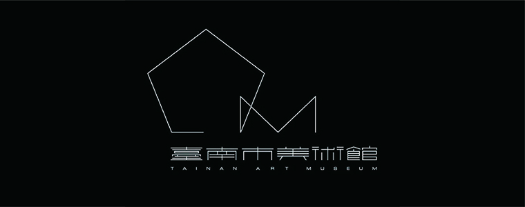
This is the case. Recently, a netizen photographed the new logo designed by the original research institute for the Tainan Art Museum, uploaded it to the social platform, and wrote the article "The original research will cry!" caused a heated discussion among netizens.
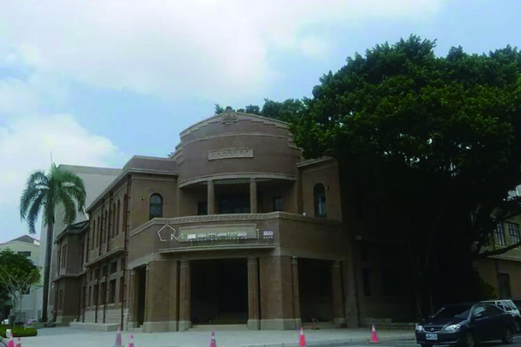

As can be seen from the photos, the new LOGO stands directly on top of the traditional gate, causing the new signboards to become less coordinated with traditional buildings. In particular, because LOGO's fonts are relatively slender, the characters with more strokes will appear "sticky" phenomenon, such as the traditional "Taiwan" word, which is basically a piece of paste. For this, the netizen diss original research work lacks sincerity, and many designs are a template set.
Xiaobian is a design worker who understands the reasons for some things in the spirit of respecting the designer.
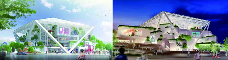
According to reports, the museum is divided into the first and second halls. The first one is the traditional building in the picture. The government believes that the original Tainan police station will be transformed into an art gallery in the future. The effect of "double halls in one" of art, in order not to disturb the appearance of the building, directly put the new logo on the top of the building. Hall 2 is a contemporary pavilion designed by Japanese architect Shigeru Ban.
The Chinese font designer Xu Yuwen (Tencent fonts also participated in the design) for the "adhesive" font also expressed his opinion on this new LOGO: it is more professional than other Taiwanese art galleries and museum standard words.
Back to the origin, we said back to the new logo. The “pentagon” structure of the museum, the architectural features and the heading “M” of the museum (Museum) are symbolically represented by simple lines. The shape of the slim lines can be transformed and extended into a variety of shapes. The font design uses a straight line to highlight the refined shape of the traditional characters.


Xiao Bian believes that the overall design scheme expresses the uniqueness and avant-garde of Chinese characters, and can widely publicize the existence of the Tainan City Art Museum.
As for the original research, the dissert design is not sincere. Xiaobian believes that as a design master, the original researcher can no longer use his design to shape his works. He is committed to researching the design viewpoint "nothing but all", resulting in the current extreme. Personal stylization. In other words, this is the "brand" he created for himself. If there is a brand to find him to design, there is a big "Jiang Taigong fishing, willing to hook up."
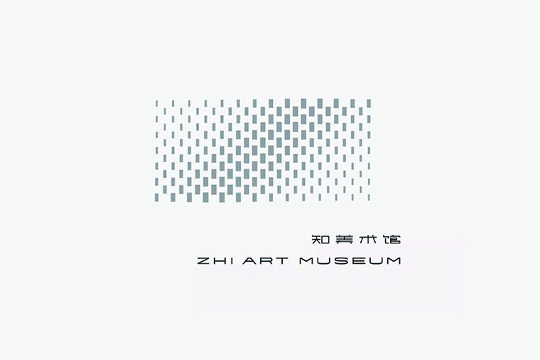
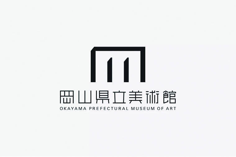
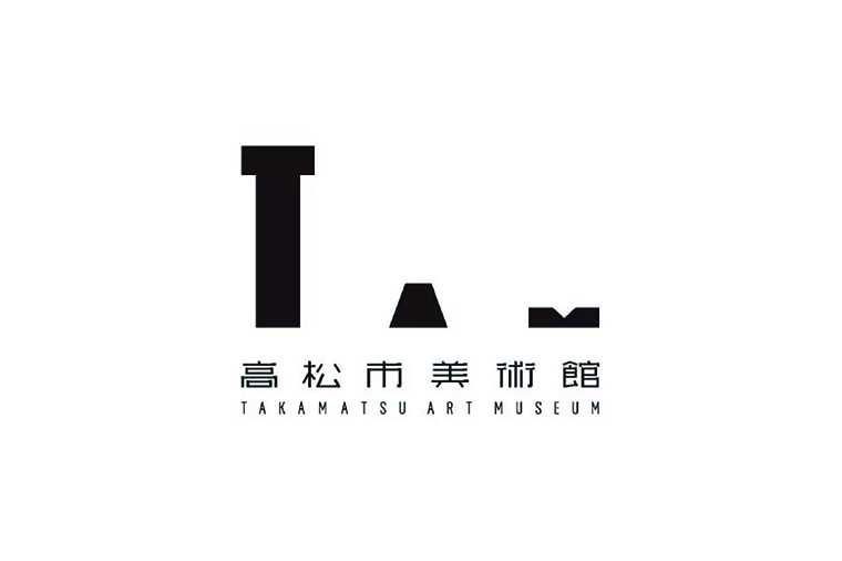
Finally, let's take a look at the gallery logo designed by the original research institute.

Support Hotline:186-8877-7094
Brand Consultant and Consultation: Mr. Du / Miss Shi
Phone:18811873033 / 18688777094
E-mail:xicao@xicaodesign.com
Office:A1101,ZhanTao Building,MinZhi Avenue,Longhuaxin District,Shenzhen,China


Brand Consultant and Consultation: Mr. Du / Miss Shi
Phone:18811873033 / 18688777094
E-mail:xicao@xicaodesign.com
Office:A1101,ZhanTao Building,MinZhi Avenue,Longhuaxin District,Shenzhen,China
