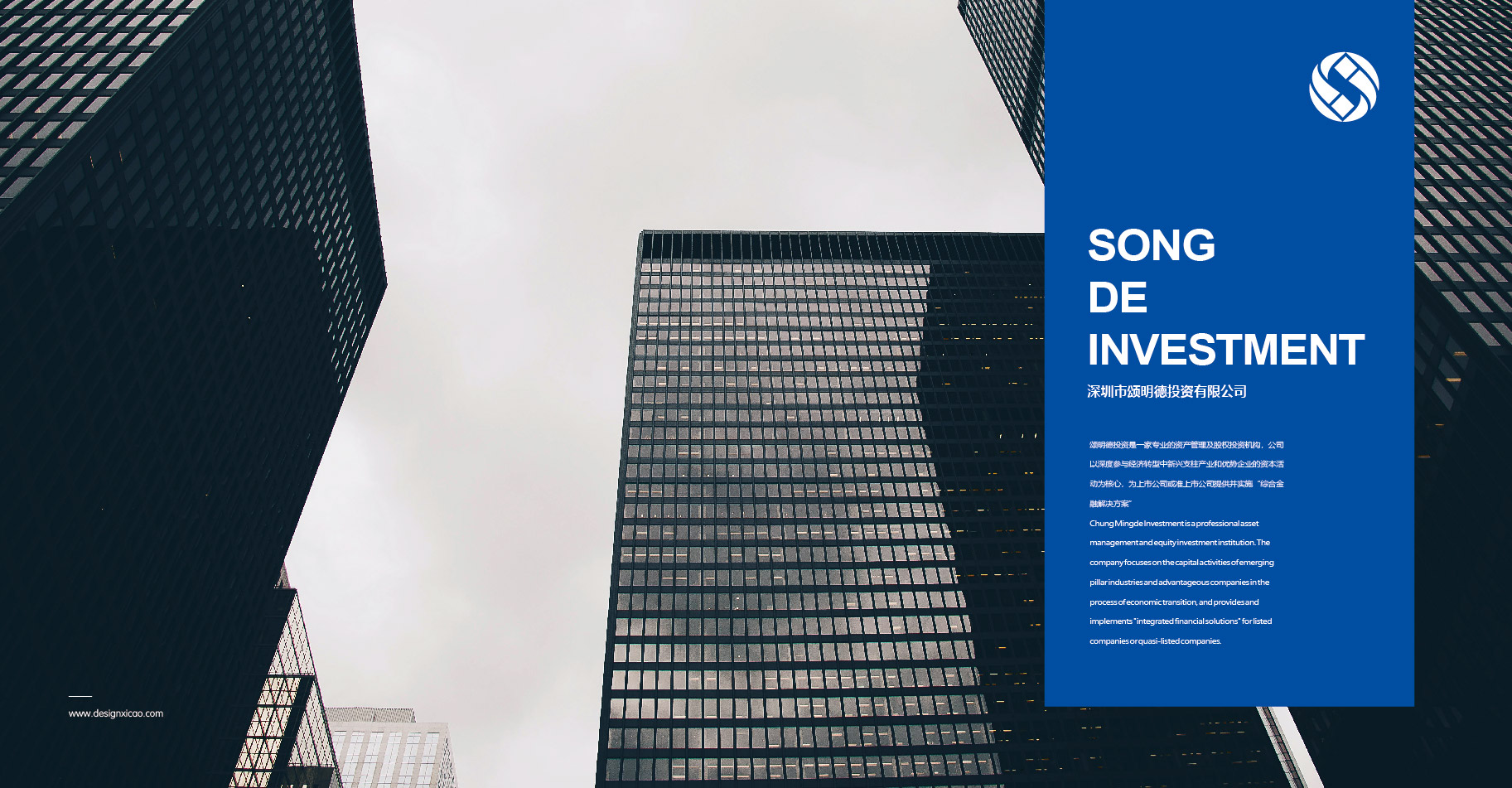
A professional asset management and equity institution that provides “integrated financial solutions” for listed companies and quasi-listed companies, with deep involvement in the activities of emerging pillar industries and advantageous enterprises in the economic transformation.
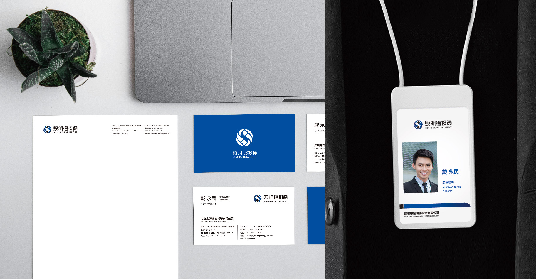
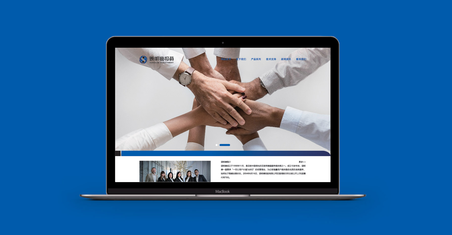
Yan Mingde has been deeply involved in the financial industry for several years. He has formed a certain scale of development in the asset management and investment institutions and has significant industry advantages. He is now ready to enter the international market, but he does not know how to face the market with a new image. After receiving the entrustment, Xicao Brand Design Company made a full understanding of Min Mingde's development history, corporate philosophy and development needs, and designed a new brand logo and a VI application system for Yan Mingde.
Client's Name : SONG MINGDE FINANCE
Service Content : Brand logo VI design
Date of Creation : 2017.07.30
A professional asset management and equity institution that provides “integrated financial solutions” for listed companies and quasi-listed companies, with deep involvement in the activities of emerging pillar industries and advantageous enterprises in the economic transformation.
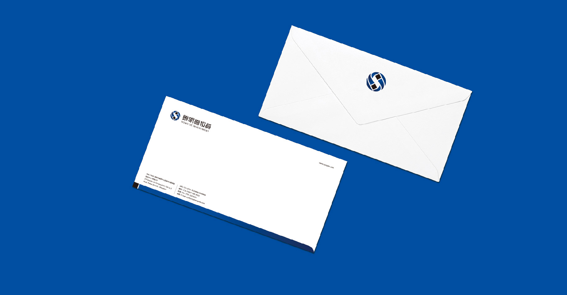
In order to face the international market, in 2017, Xicao brand design Company was authorized to transform and upgrade its brand image.
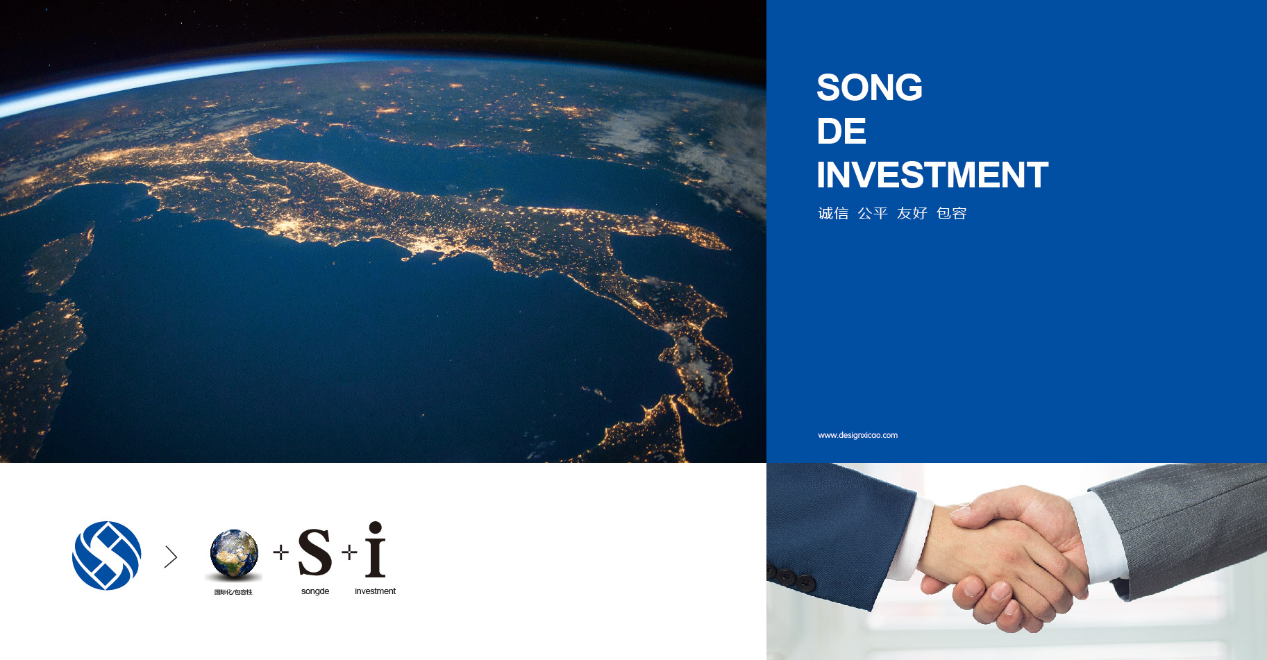
Yan Mingde has been deeply involved in the financial industry for several years. He has formed a certain scale of development in the asset management and investment institutions and has significant industry advantages. He is now ready to enter the international market, but he does not know how to face the market with a new image.
After receiving the entrustment, Xicao brand design Company made a full understanding of Min Mingde's development history, corporate philosophy and development needs, and designed a new brand logo and a VI application system for Yan Mingde.
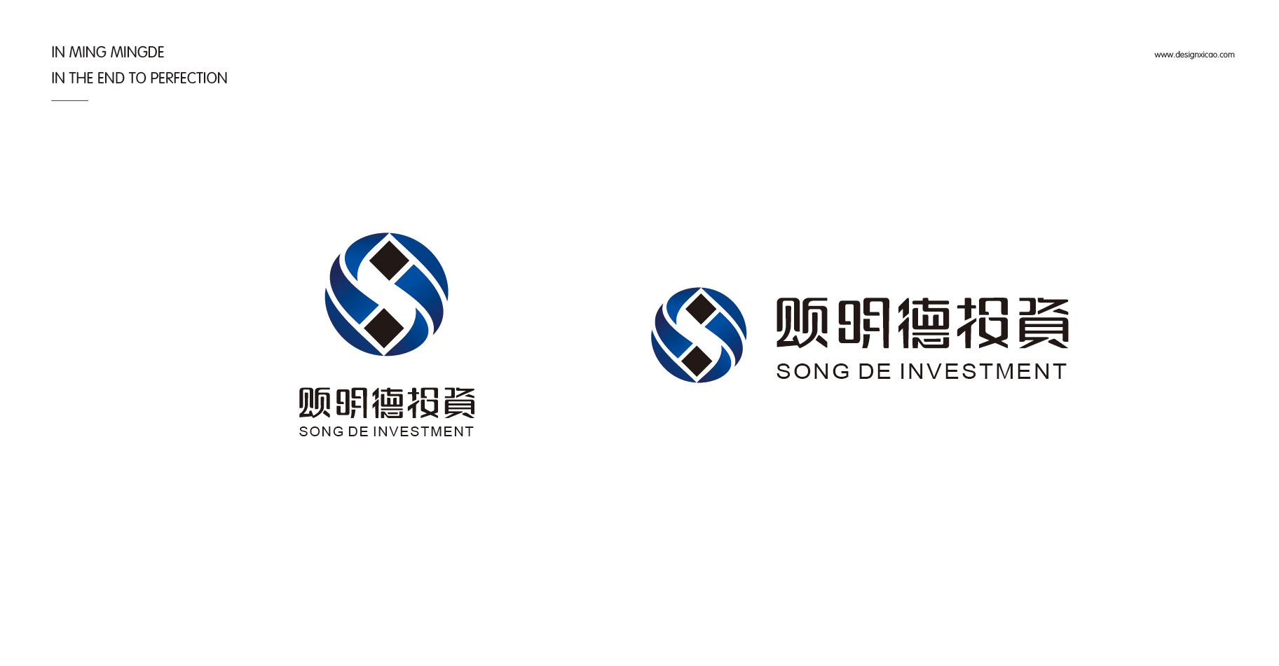
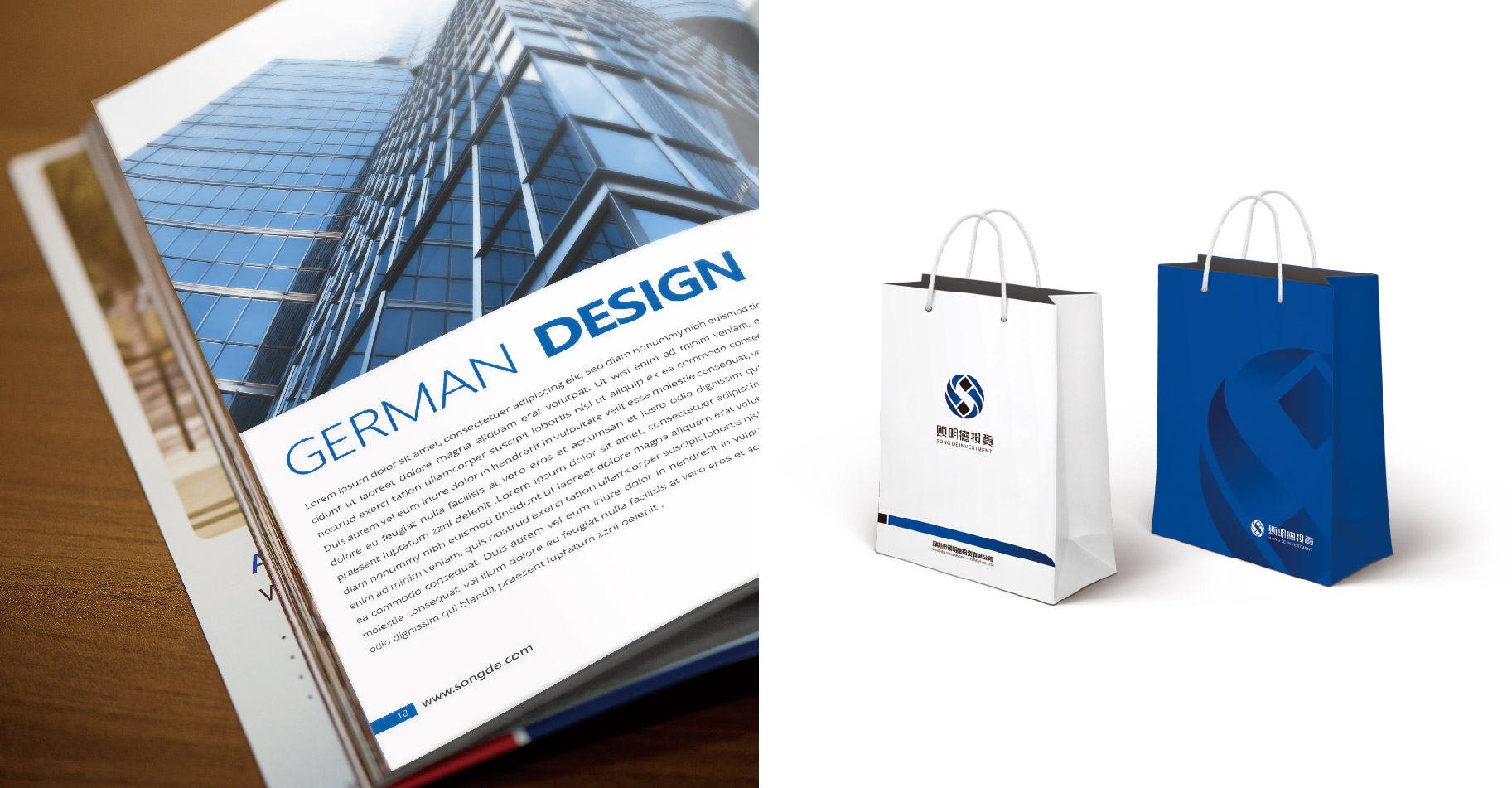
Logo is a perfect symmetrical figure composed of the letters "S, I". The thick lines make the picture look more stable and full, the beautiful curves make the picture full of rhythm and vividness, the blue-violet gradient makes the picture create space and layering, and the repeated design makes the whole picture bright and rhythmic.
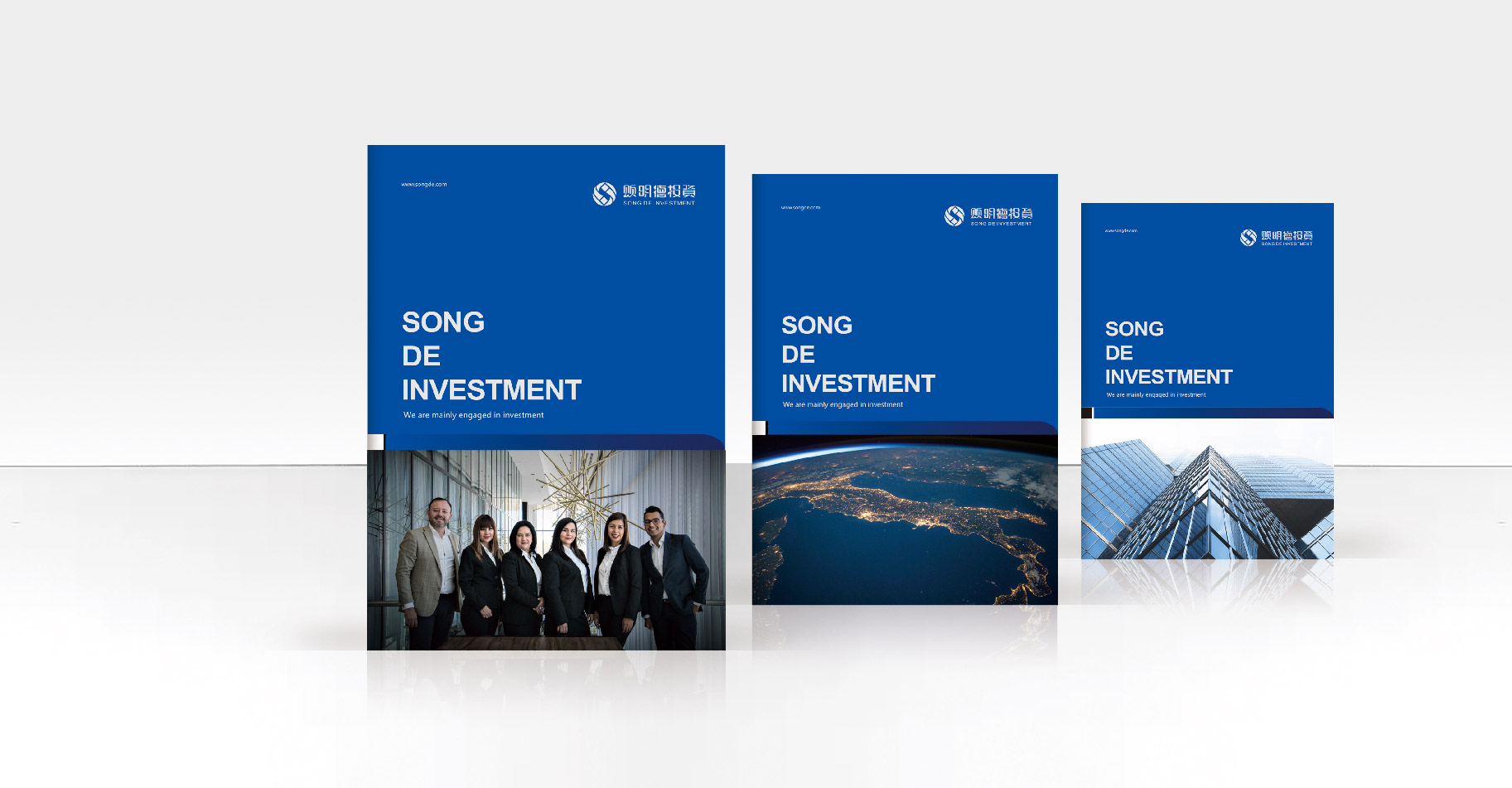
The overall picture is orderly, regular, rhythmic, and rhythmic, giving the viewer a simple, atmospheric, and rigorous visual experience.
In the figure, “S” stands for “songde” and is also the pinyin initial of “SONG”; the two “I” letters that end to end indicate Investment and Iternationgalization (internationalization) ;
It symbolizes the unique corporate personality of “Song Mingde” and conveys its corporate philosophy of investing as the core for international development.
More:brand design www.designxicao.com

Red wine brand designs
Huadu Red Wine Brand Manufacturing Co., Ltd.
Corporate Design, Logoentwicklung, Keyvisuals, Editorial Design, Brand Design
UAV INNOVATIVE BRAND UPGRADE
Shenzhen UAV Innovation Technology Co., Ltd.
Brand VI upgrade, brand logo upgrade, album design
BEST LUCK OPERATION BRAND UPGRADE DESIGN
Shenzhen Best Luck Operation Management Co., Ltd.
Brand design, VI design, book design, website design
MARASIL INTERNATIONAL BRAND UPGRADE
Japan Marasil Beauty Technology Co., Ltd.
Brand image design, VI design, packaging design, space design, website design
CUSTOMER NEEDS TO KNOW
Customer needs to know
Brand design, VI design, packaging design, space design, website design
COREY CULTURE MANUAL
Cultural brochure design
Album design, logo design, stationery design, publishing design

Support Hotline:186-8877-7094
Brand Consultant and Consultation: Mr. Du / Miss Shi
Phone:18811873033 / 18688777094
E-mail:xicao@xicaodesign.com
Office:A1101,ZhanTao Building,MinZhi Avenue,Longhuaxin District,Shenzhen,China


Brand Consultant and Consultation: Mr. Du / Miss Shi
Phone:18811873033 / 18688777094
E-mail:xicao@xicaodesign.com
Office:A1101,ZhanTao Building,MinZhi Avenue,Longhuaxin District,Shenzhen,China
